
At Ovivio, we love a graph when it can make information easier to understand. Financial information, cohort pie charts, forecasting – the list goes on, but one of the most straightforward and helpful is the staff ratio chart.
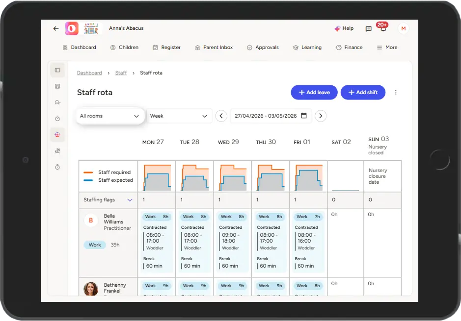
It used to be that you had to go room-by-room to see your ratios represented with colours and gaps to show where expected didn’t match required. If a room was under-staffed, you’d have to go hunt for the room that had a staff member spare to move them over, like during lunch for example.

Now, however, we’ve gone bigger. We’ve taken those room-by-room charts, added them all together, and now you can see your whole setting’s ratios represented with those handy charts too. If you’ve only got one physical room but like to keep them separated in your staffing (for different age groups for example), your Ovivio platform can now show you at a glance what that looks like.
It’ll be easier than ever to stay on-ratio at all times, keeping all children safe and sound. Manage lunch breaks with ease, identify those staff absences that’ll impact you less or more depending on which room they were in, and optimise to the nth degree to avoid over- and under-staffing day by day. Save money, save time, all with Ovivio.
Don’t have Ovivio? Book an Ovivio demo!